
Scale Settings for Trend Lines
When prices are presented on a semi-log scale, it appears that the alignment of the high and low points on trend lines is improved. This is especially true when long-term trend lines are being drawn or when there is a large change in price. Most charting programs allow users to set the scale as arithmetic or semi-log. An arithmetic scale displays incremental values (5,10,15,20,25,30) evenly as they move up the y-axis. A $10 movement in price will look the same from $10 to $20 or $100 to $110. A semi-log scale displays incremental values in percentage terms as they move up the y-axis. A move from $10 to $20 is a 100% gain and would appear to be much larger than a move from $100 to $110, which is only a 10% gain.
Between the years 2000 and 2001, there were two false breaks above the downtrend line on AMZN’s weekly chart (see below). These false breakouts could have led to premature buying as the stock declined after each one. The stock lost 60% of its value three times over two years. The percentage loss is evenly represented on the semi-log scale, and the downtrend line has never been broken.
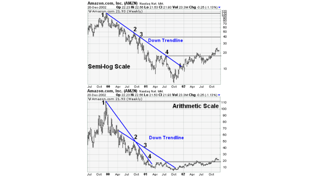
Examples of semi-log versus arithmetic scale charts showing downtrend lines. EMC saw a significant pricing shift over an extended period of time. The rise rate looks smoother on the semi-log scale, but on the arithmetic scale, there were no false breaks below the uptrend line. In less than two years, EMC doubled three times. The trend line fits all the way up on the semi-log scale. To keep up with the advance, three trend lines were needed on the arithmetic scale.
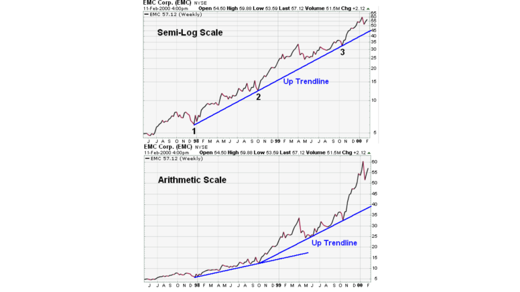
Examples displaying uptrend lines in semi-log and arithmetic scale charts.
If you intrsted to learn about the Trend Lines, How Are They Used, and Why Are They Important?
How Do You Validate a Trend Line?
To draw a trend line, two or more points are required. The validity of the support or resistance level that the trend line represents increases with the number of points utilized to draw it. Finding more than two points to build a trend line from might occasionally be challenging. It is not always feasible to draw trend lines on every price chart, despite the fact that they are a crucial component of technical analysis. When the highs and lows don’t match, it’s best to avoid pushing the matter. An upward trend line that has been touched four times can be seen in the Microsoft (MSFT) chart below. The trend line was regarded as a legitimate support line with the third contact in November 1999.
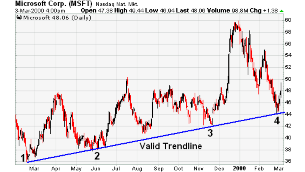
Example of a valid uptrend line.
The support level’s soundness was further strengthened when the stock price bounced off the trend line level a fourth time. The trend will continue to be controlled by the bulls as long as the stock stays above the trend line, or support. A breach below would indicate that net supply was rising and that a trend shift might be on the horizon.
What Are the Spacing Rules for Trend Lines?
The lows used to form an uptrend line and the highs used to form a downtrend line should not be too far apart or close together. The most suitable distance apart will depend on the timeframe, the degree of price movement, and personal preferences.
If the lows (highs) are too close together, the validity of the reaction low (high) may be in question. If the lows are too far apart, the relationship between the two points could be suspect. An ideal trend line comprises relatively evenly spaced lows (or highs). In the MSFT illustration above, well-spaced low points are depicted by the trend line. In the WalMart (WMT) example below, the second high point appears too close to the first high point for a valid trend line; however, it would be feasible to draw a trend line beginning at point 2 and extending down to the February reaction high.
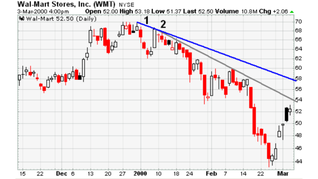
Example of a trendline where the second high point is too close to the first one.
What Are Trend Angles?
As the steepness of a trend line increases, the validity of the support or resistance level decreases. A steep trend line results from a sharp advance (or decline) over a brief period. The angle of a trend line created from such sharp moves is unlikely to offer a meaningful support or resistance level. Attempting to play a trend line break or utilize the established support and resistance level will frequently prove difficult, even if the trend line is formed with three points that appear to be valid.
In the chart below, there were four trend line touches over five months. The spacing between the points is reasonable, but the steepness of the trend line could be more sustainable, and the price is more likely than not to drop below the trend line. However, trying to time this drop or make a play after the trend line is broken is a difficult task.
Example of a steep trendline.
The amount of data displayed and the chart size can affect the angle of a trend line. When assessing the validity and sustainability of a trend line, keep in mind that short and wide charts are less likely to have steep trend lines than long and narrow charts.
What Are Internal Trend Lines?
Sometimes, you may see the possibility of drawing a trend line, but the exact points do not match up cleanly. The highs or lows might be out of whack, the angle too steep, or the points too close together. If one or two points were ignored, you could form a fitted trend line. But with market volatility, prices can overreact and produce spikes that distort the highs and lows. One method for dealing with over-reactions is to draw internal trend lines, which ignore these price spikes to a reasonable degree.
The long-term trend line for the S&P 500 ($SPX) extends up from the end of 1994 and passes through low points in July 1996, September 1998, and October 1998. The extreme price movements that protruded below the trend line led to these lows, which were formed with selling peaks. The trend line appears to be at a reasonable angle when drawn through the lows, and the other lows match up well.
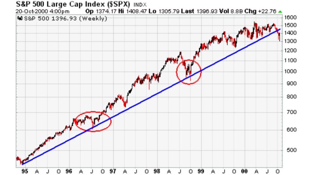
Example of an internal trend line.
Sometimes, a price cluster with a high or low spike stands out. In a price cluster, prices are grouped within a tight range over time. You can ignore the price spikes by using the price cluster to draw the trend line.
The Coca-Cola (KO) chart below shows an internal trend line formed by ignoring price spikes and using price clusters instead.
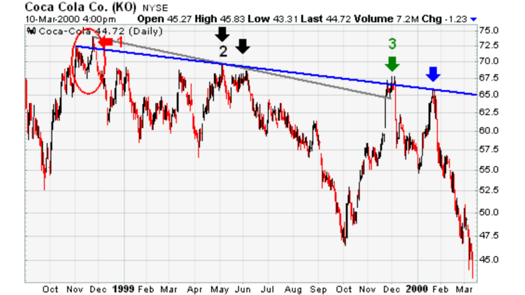
Example of an internal trend line using price clusters.
October and November 1998 saw the formation of KO peaks, with the November peak being somewhat higher than the October peak (red arrow). The slope would have been more negative and there would have seemed to be a breakout in December 1998 (gray line) if a trend line had been drawn using the November high. However, due to the May–June highs being too close to one another, this would have only been a two-point trend line (black arrows). It would have been feasible to create an internal trend line using the price clusters surrounding the October/November 1998 and December 1999 peaks (blue line) once the December 1999 peak formed (green arrow). This trend line correctly predicts resistance in January 2000 and is based on three strong touches.
The Bottom Line
Although trend lines can provide valuable information, they can also generate false signals if they are applied incorrectly. Other methods, like peak-and-trough analysis or horizontal support and resistance levels, should be used to validate trend line breakdowns.
Although they are a common analytical tool, trend lines are just one method for identifying, evaluating, and validating a trend. The price on the chart below appeared to be a legitimate support level after touching the uptrend line four times. The prior response low remained and did not validate the trend line break, even though the trend line was broken in January 2000. Before the trend line broke, the stock also hit a new higher high.
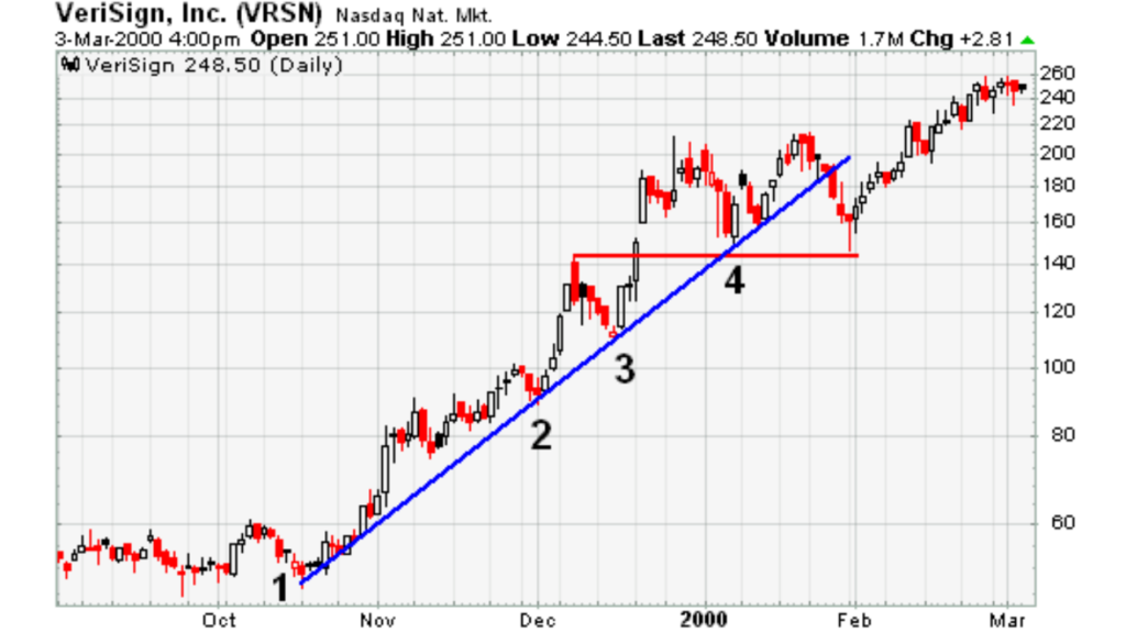
Example of a trendline break that didn’t reverse the trend.
Trend line breakdowns should only be used as a signal that a trend shift may be on the horizon, not as the ultimate judge. Investors and traders are able to pay more attention to other confirming signals for a possible trend change by employing trend line breaks as warnings.
you may be interested in this blog here:

