
Trend lines are straight lines that connect two or more price points on a chart to identify and confirm trends.
Trend lines are a fundamental tool in technical analysis that traders and analysts use to identify and anticipate the market’s general price movement pattern. Essentially, they represent a visual depiction of support and resistance levels in any time frame.
The importance of trend lines in technical analysis lies in their ability to provide a clear visual representation of market trends and potential reversal points, which can help traders make informed trading decisions. They provide a simple yet effective means to identify and anticipate market behavior.
Many of the principles applicable to support and resistance levels can be applied to trend lines as well. It’s important that you understand all of the concepts presented in our Support and Resistance article before continuing on.
What Is an Uptrend Line?
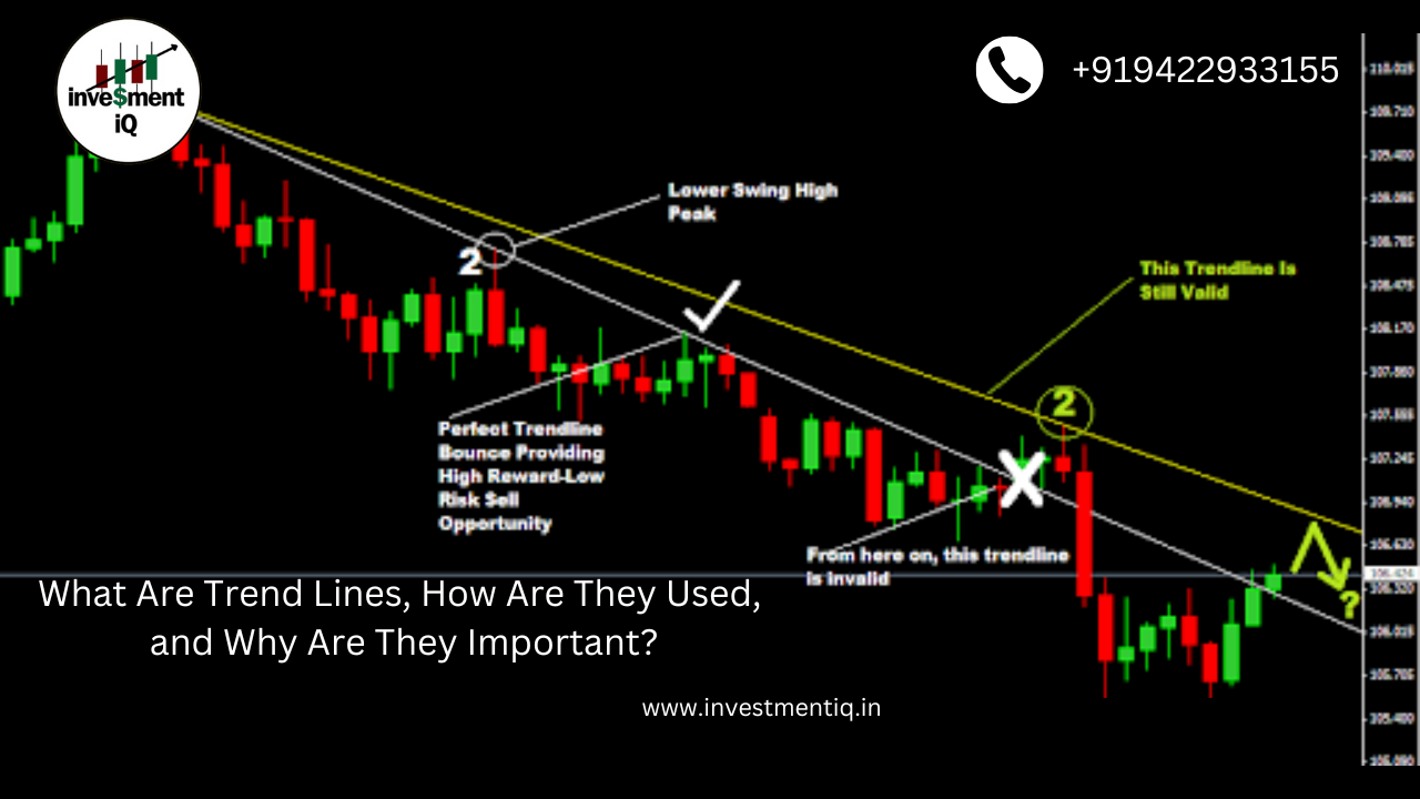
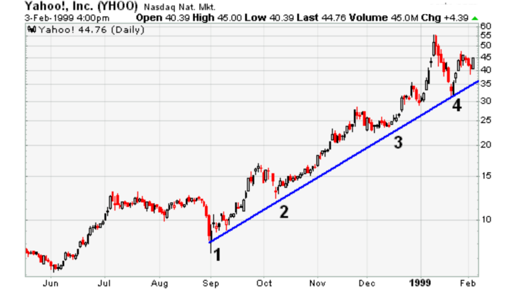
An uptrend line has a positive slope and is formed by connecting two or more low points. The second low must be higher than the first for the line to have a positive slope. Note that at least three points must be connected before the line is considered a valid trend line.
An illustration of an upward trend line on a stock chart. Even as prices climb, uptrend lines serve as support and show that net demand—demand less supply—is rising. When demand and price are rising together, it is quite optimistic and indicates that buyers are very determined. The uptrend is seen as stable and unbroken as long as prices stay above the trend line. A decline in net demand and the possibility of a trend shift are indicated by a breach below the uptrend line.
What Is a Downtrend Line?
A downtrend line has a negative slope formed by connecting two or more high points. The second high must be lower than the first for the line to have a negative slope. Note that at least three points must be connected before the line is considered a valid trend line.
Example of a downtrend in a stock chart.
Even when the price is down, downtrend lines serve as resistance and show that net supply—that is, supply less demand—is rising. It is extremely bearish and demonstrates the sellers’ strong resolve when a price decline is accompanied by an increase in supply. The downtrend is strong and unbroken as long as prices stay below the line. A decline in net supply and the possibility of an impending trend change are indicated by a break above the downtrend line.
Scale Settings for Trend Lines
High and low points appear to line up better for trend lines when prices are displayed using a semi-log scale. This is especially true when long-term trend lines are being drawn or when there is a large change in price. Most charting programs allow users to set the scale as arithmetic or semi-log. An arithmetic scale displays incremental values (5,10,15,20,25,30) evenly as they move up the y-axis. The price will remain the same at $10, whether it goes from $10 to $20 or $100 to $110. A semi-log scale displays incremental values in percentage terms as they move up the y-axis. A move from $10 to $20 is a 100% gain and would appear to be much larger than a move from $100 to $110, which is only a 10% gain.
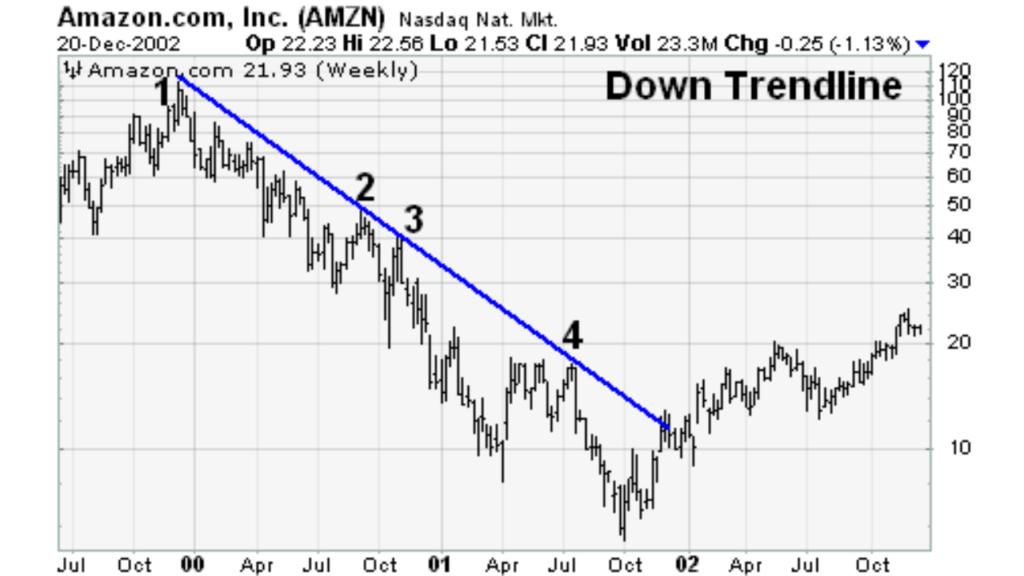
In the weekly chart of AMZN (see below), there were two false breaks above the downtrend line as the stock declined between 2000 and 2001. These false breakouts could have led to premature buying as the stock declined after each one. Over the course of two years, the stock lost 60% of its value three times. The semi-log scale reflects the percentage loss evenly, and the downtrend line was never broken.
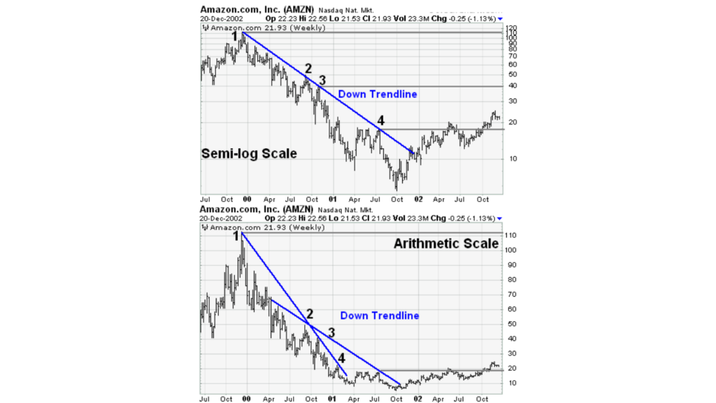
Examples displaying downtrend lines in semi-log vs. arithmetic scale charts.
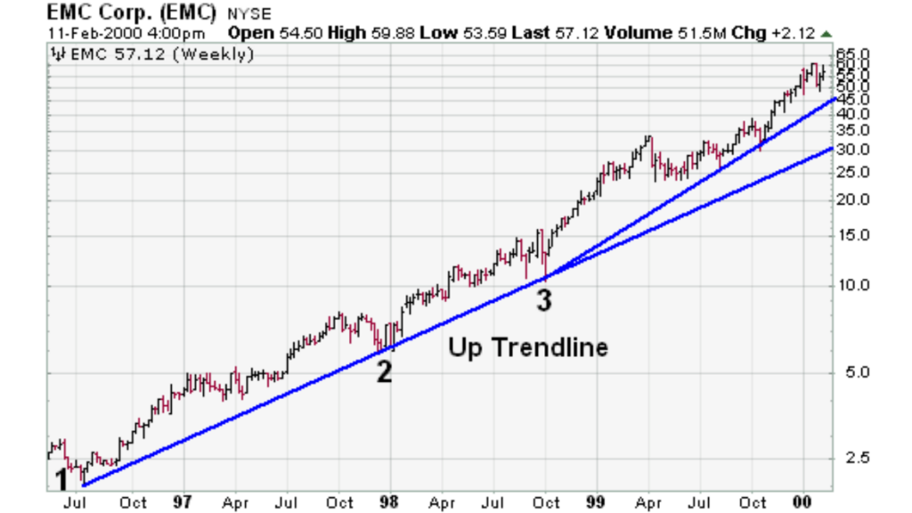
In the case of EMC, there was a large price change over a long period. While there were no false breaks below the uptrend line on the arithmetic scale, the ascent rate appears smoother on the semi-log scale. EMC doubled three times in less than two years. On the semi-log scale, the trend line fits all the way up. On the arithmetic scale, three trend lines were required to keep pace with the advance.
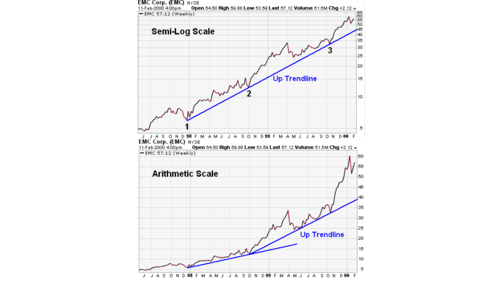
Examples displaying uptrend lines in semi-log and arithmetic scale charts.
How Do You Validate a Trend Line?
It takes two or more points to draw a trend line. The more points used to draw the trend line, the more validity is attached to the support or resistance level represented by the trend line. It can sometimes be difficult to find more than 2 points from which to construct a trend line. Drawing trend lines on every price chart is not always possible, despite the fact that trend lines are a crucial component of technical analysis. Sometimes, the lows or highs don’t match up, and it is best not to force the issue.
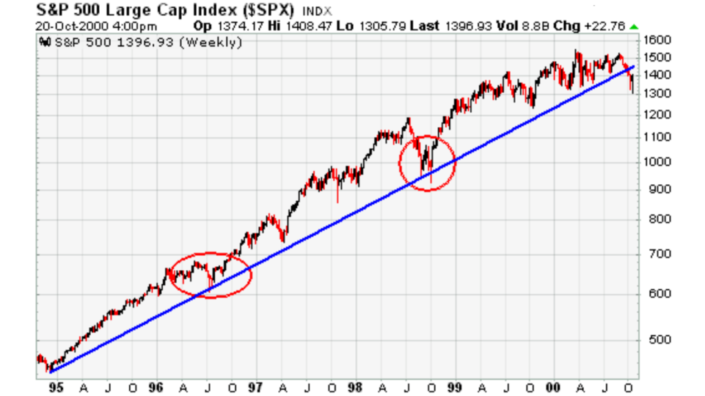
The chart of Microsoft (MSFT) below shows an uptrend line that has been touched four times. The trend line was thought to be a valid support line after the third touch in November 1999.
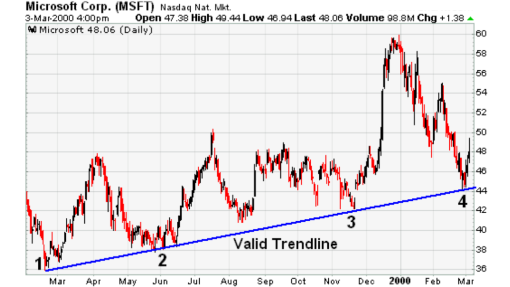
Example of a valid uptrend line.
When the stock price bounced off the trend line level a fourth time, the soundness of the support level was enhanced even more. As long as the stock remains above the trend line (support), the trend will remain in control of the bulls. A break below would signal that net supply was increasing and that a change in trend could be imminent.
What Are the Spacing Rules for Trend Lines?
The lows used to form an uptrend line and the highs used to form a downtrend line should not be too far apart or close together. The most suitable distance apart will depend on the timeframe, the degree of price movement, and personal preferences.
If the lows (highs) are too close together, the validity of the reaction low (high) may be in question. If the lows are too far apart, the relationship between the two points could be suspect. An ideal trend line comprises relatively evenly spaced lows (or highs). The trend line in the above MSFT example represents well-spaced low points.
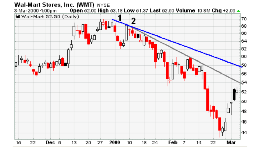
In the WalMart (WMT) example below, the second high point appears too close to the first high point for a valid trend line; however, it would be feasible to draw a trend line beginning at point 2 and extending down to the February reaction high.
IF YOU WANT TO KNOW ABOUT INDICATORS
What Are Trend Angles?
In the chart below, there were four trend line touches over five months. The spacing between the points is reasonable, but the steepness of the trend line could be more sustainable, and the price is more likely than not to drop below the trend line. However, trying to time this drop or make a play after the trend line is broken is a difficult task.
Example of a steep trendline.
The amount of data displayed and the chart size can affect the angle of a trend line. When assessing the validity and sustainability of a trend line, keep in mind that short and wide charts are less likely to have steep trend lines than long and narrow charts.
What Are Internal Trend Lines?
Example of an internal trend line.
The prospect of creating a trend line may occasionally be apparent, although the precise points may not always line up perfectly. The points may be too near to one another, the angle too steep, or the highs or lows out of balance.A fitted trend line could be created by ignoring one or two points.
However, when the market is volatile, prices may overreact, creating spikes that warp the highs and lows. Drawing internal trend lines, which somewhat disregard these price spikes, is one way to handle over-reactions.
The Coca-Cola (KO) chart below shows an internal trend line formed by ignoring price spikes and using price clusters instead.
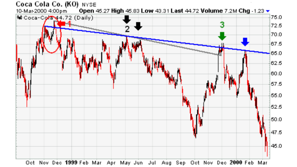
A price cluster-based internal trend line example. October and November 1998 saw the formation of KO peaks, with the November peak being somewhat higher than the October peak (red arrow). The slope would have been more negative and there would have seemed to be a breakout in December 1998 (gray line) if a trend line had been drawn using the November high. However, due to the May–June highs being too close to one another, this would have only been a two-point trend line (black arrows). After the peak established in December 1999 (green arrow), it would have been possible to draw an internal trend line based on the price clusters around the Oct/Nov 1998 and the Dec 1999 peaks (blue line). This trend line is based on three solid touches and accurately forecasts resistance in Jan 2000 (blue arrow).
The Bottom Line
Although trend lines can provide valuable information, they can also generate false signals if they are applied incorrectly. Other methods, like peak-and-trough analysis or horizontal support and resistance levels, should be used to validate trend line breakdowns.
Although they are a common analytical tool, trend lines are just one method for identifying, evaluating, and validating a trend. The price on the chart below appeared to be a legitimate support level after touching the uptrend line four times. The prior response low remained and did not validate the trend line break, even though the trend line was broken in January 2000. Before the trend line broke, the stock also hit a new higher high.
An illustration of a trendline break that did not cause the trend to reverse.
Trend line breakdowns should only be used as a signal that a trend shift may be on the horizon, not as the ultimate judge. Investors and traders are able to pay more attention to other confirming signals for a possible trend change by employing trend line breaks as warnings.
you may be interested in this blog here:

